Ooika
Strategy / Branding / Website / Print / Digital / Packaging
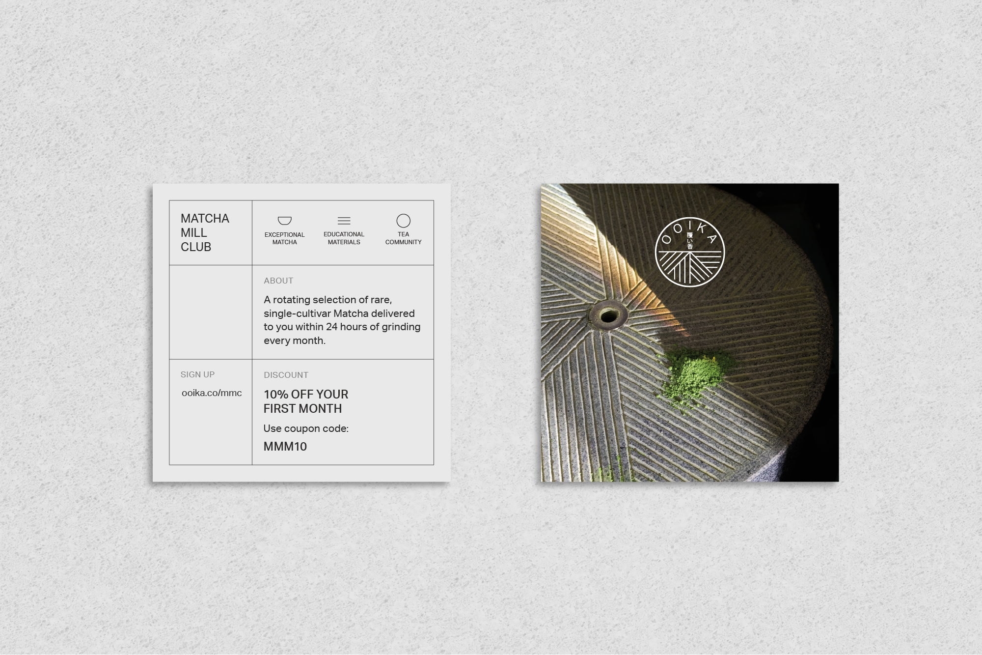
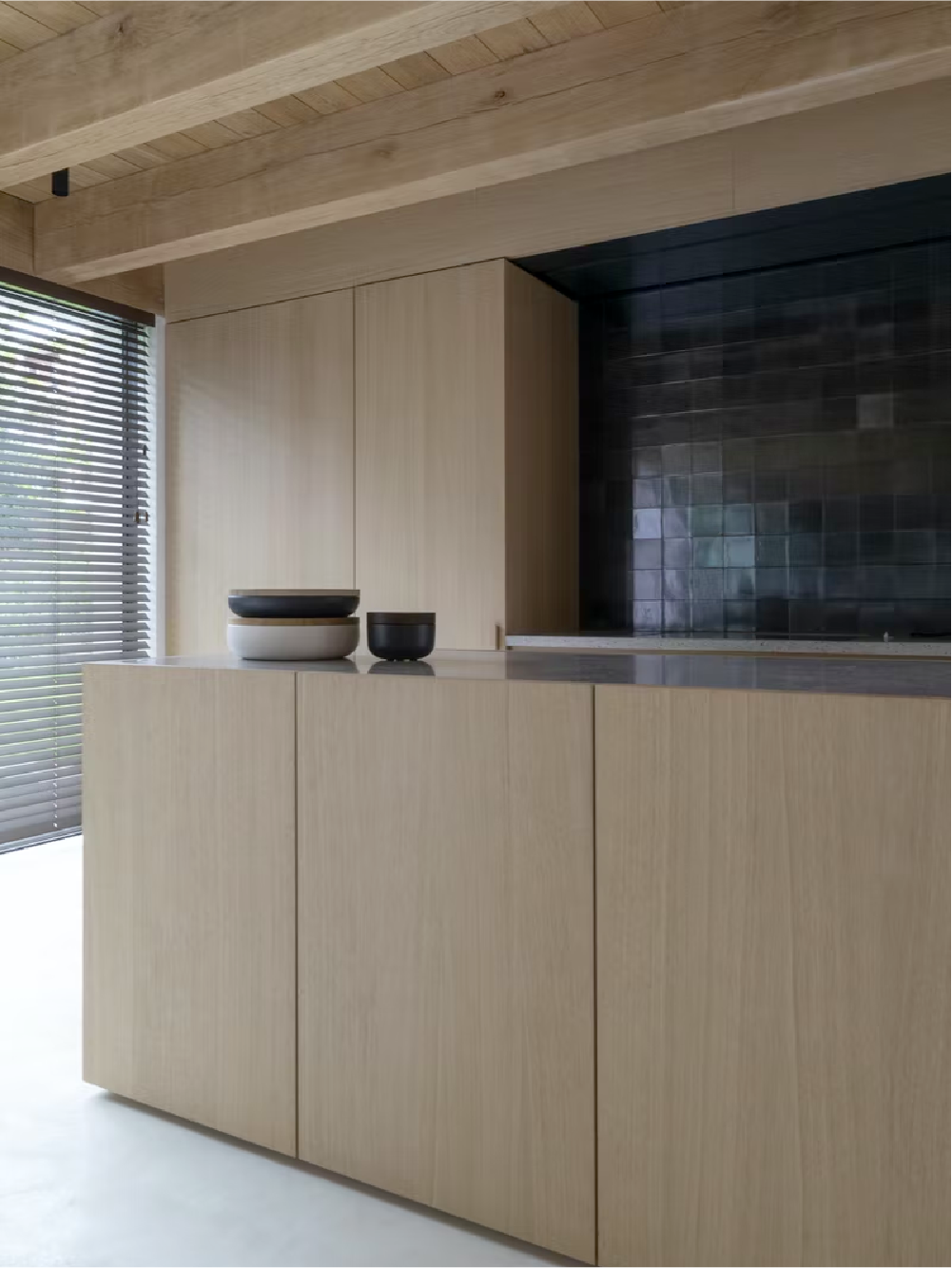
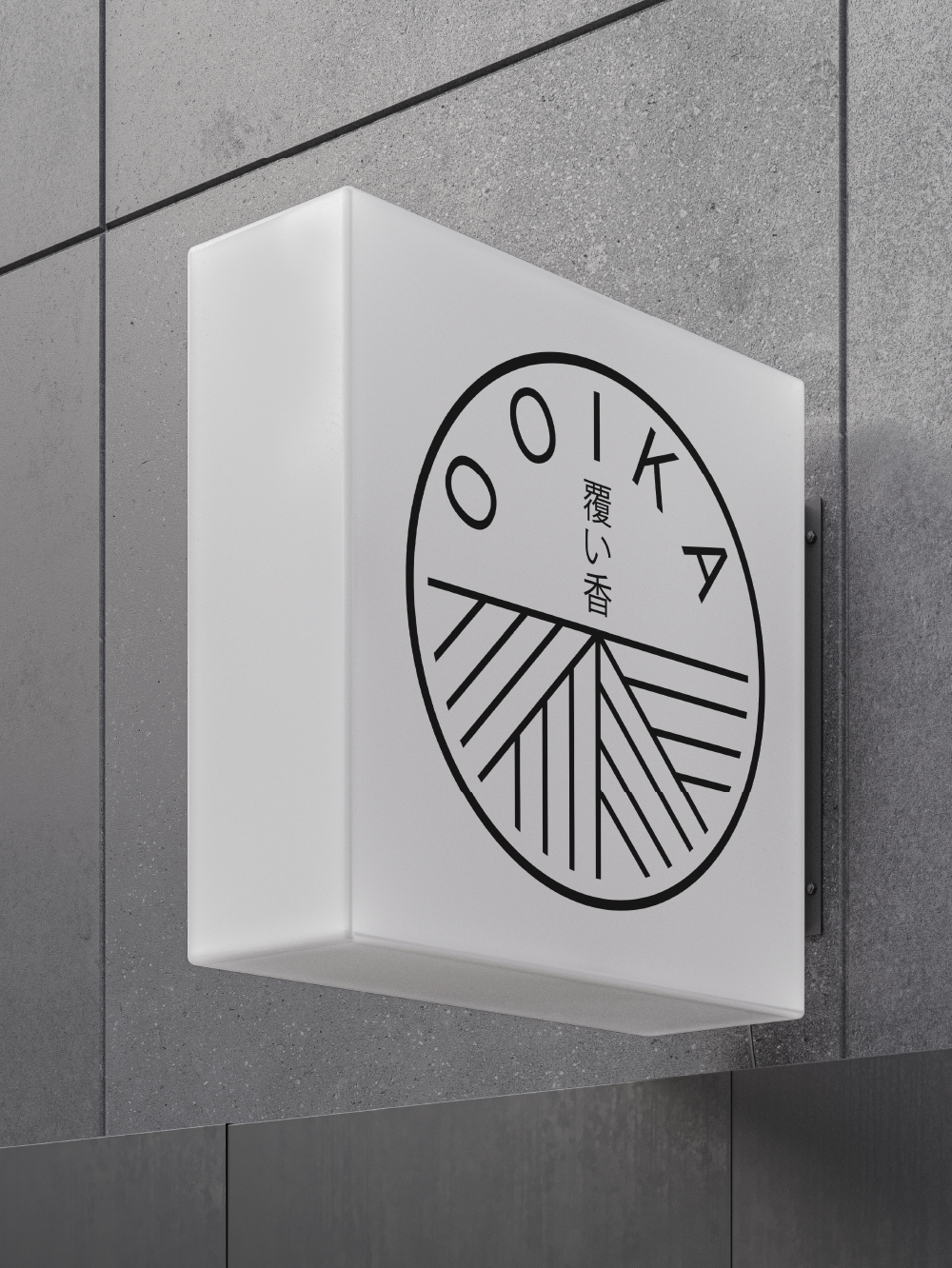
Ooika is a teahouse that focuses on single-cultivar Matchas from celebrated terroirs across Japan — all fresh ground in-house with one of the few authentic Japanese stone mills in the United States. Ooika is doing something unorthodox in the tea world, and we wanted to highlight that with a brand that’s simple, fresh, and polished. The mark represents an abstract symbol of its stone mills with its Japanese translation in the center. We chose a black and light grey palette with a hint of green to pair with a humanistic heading and san serif font, creating a brand experience that speaks to Ooika’s values — freshness, clarity, and uncompromised quality.