SHIZEN
Strategy
Branding
Website
The Strategy
Before Shizen’s rebrand, it wasn’t connecting with its ideal customers: the tea lovers that appreciate tea in its authentic form. Through this rebranding process, we were able to dive deep into its true identity and renamed it Shizen — a Japanese word that describes the beauty of human nature that made the owners fall in love with tea in the first place. Our goal was to celebrate the peaceful, artistic intent through Tea, Cuisine, and Ceramics.


The Branding
Through the brand strategy process, we discovered that their new brand should be contemporary yet grounded, organic yet solid — much like a stone carved out of the earth. We uncovered their brand archetype is Innocent - being honest, humble, and wholesome. We used colors that are earthy and muted with a little hint of brightness. To align with the brand’s core values and voice, we hand-drawn shapes that are organic against a humanist sans-serif typeface.

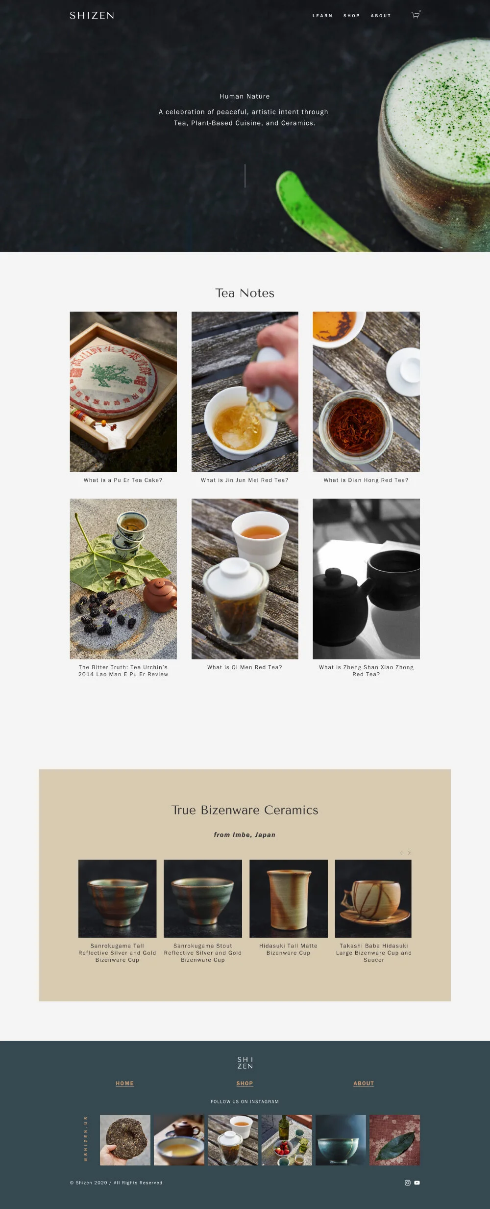
The Website
With both of the founders being photographers, we decided to heavily focus on photography on the website to showcase the artistic nature of tea itself. This resulted in a simple yet visually-stunning layout that presents the products (tea and ceramics) front and center.