FOR Architecture Co.
Brand Strategy / Brand Identity / Print / Digital
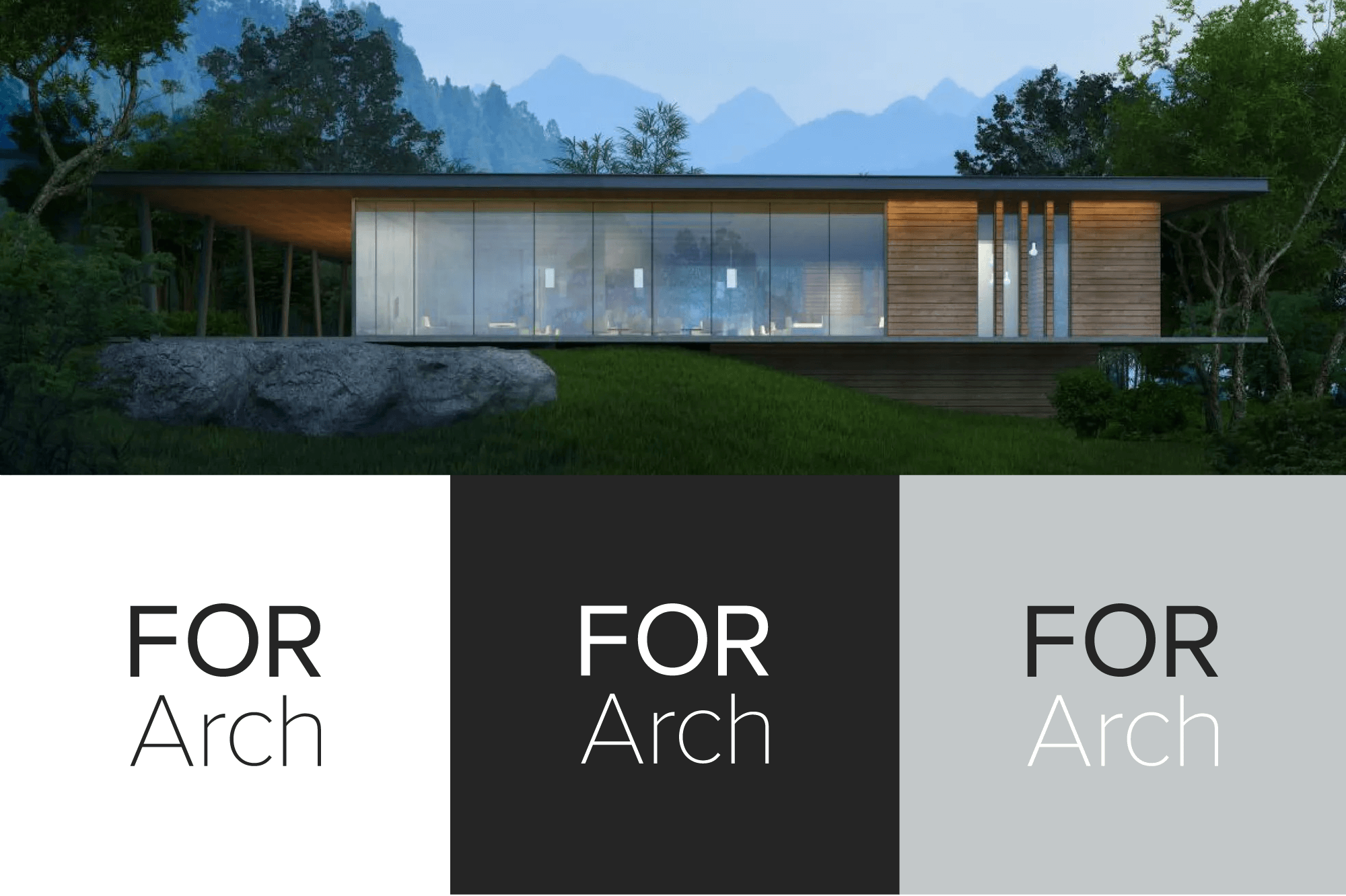
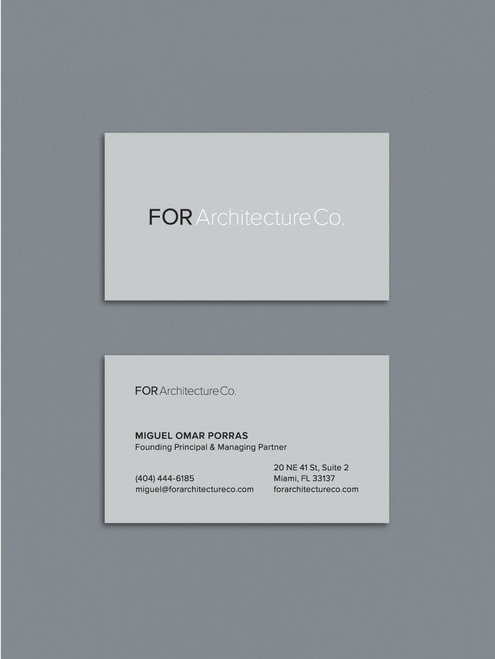
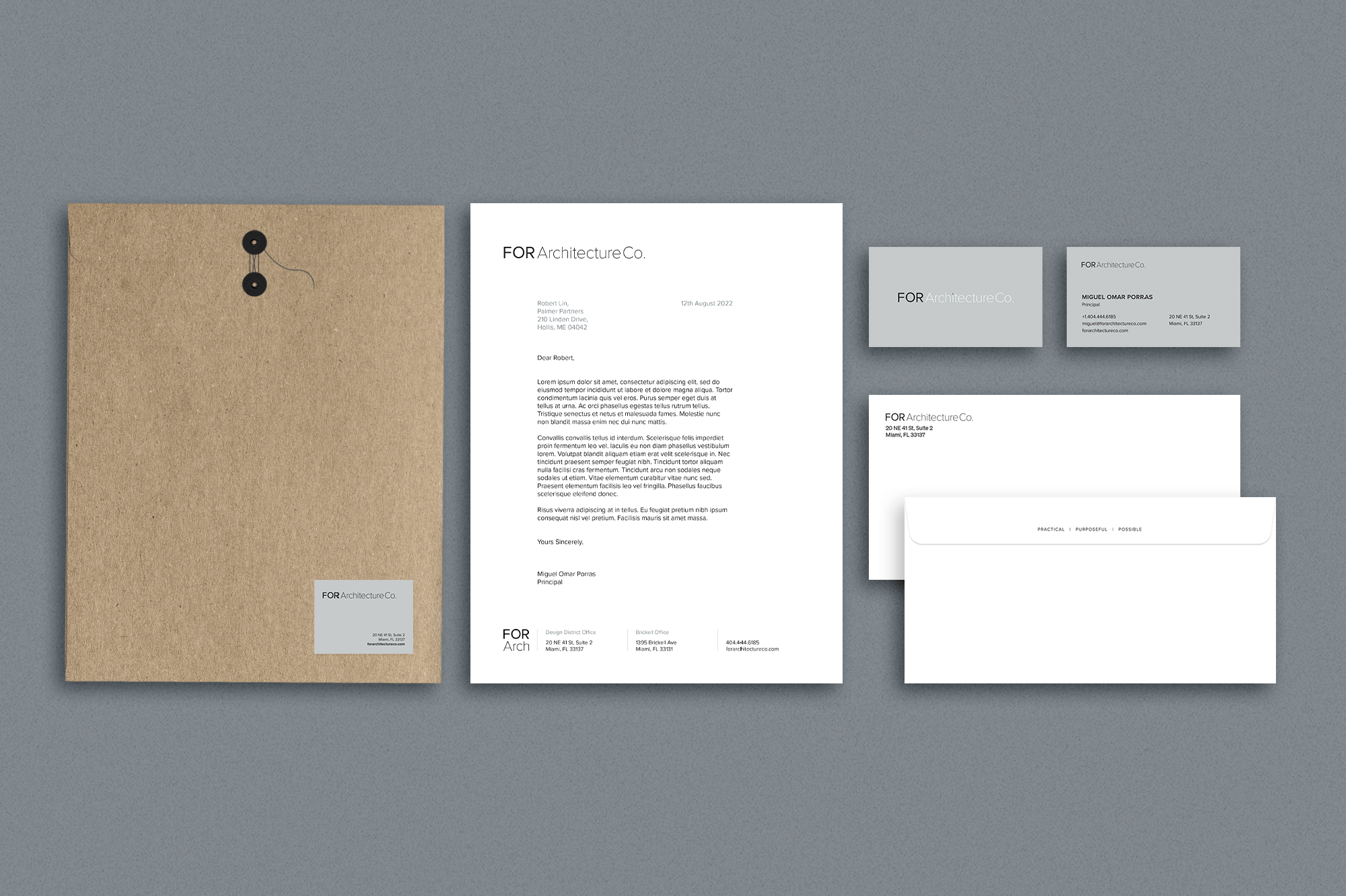
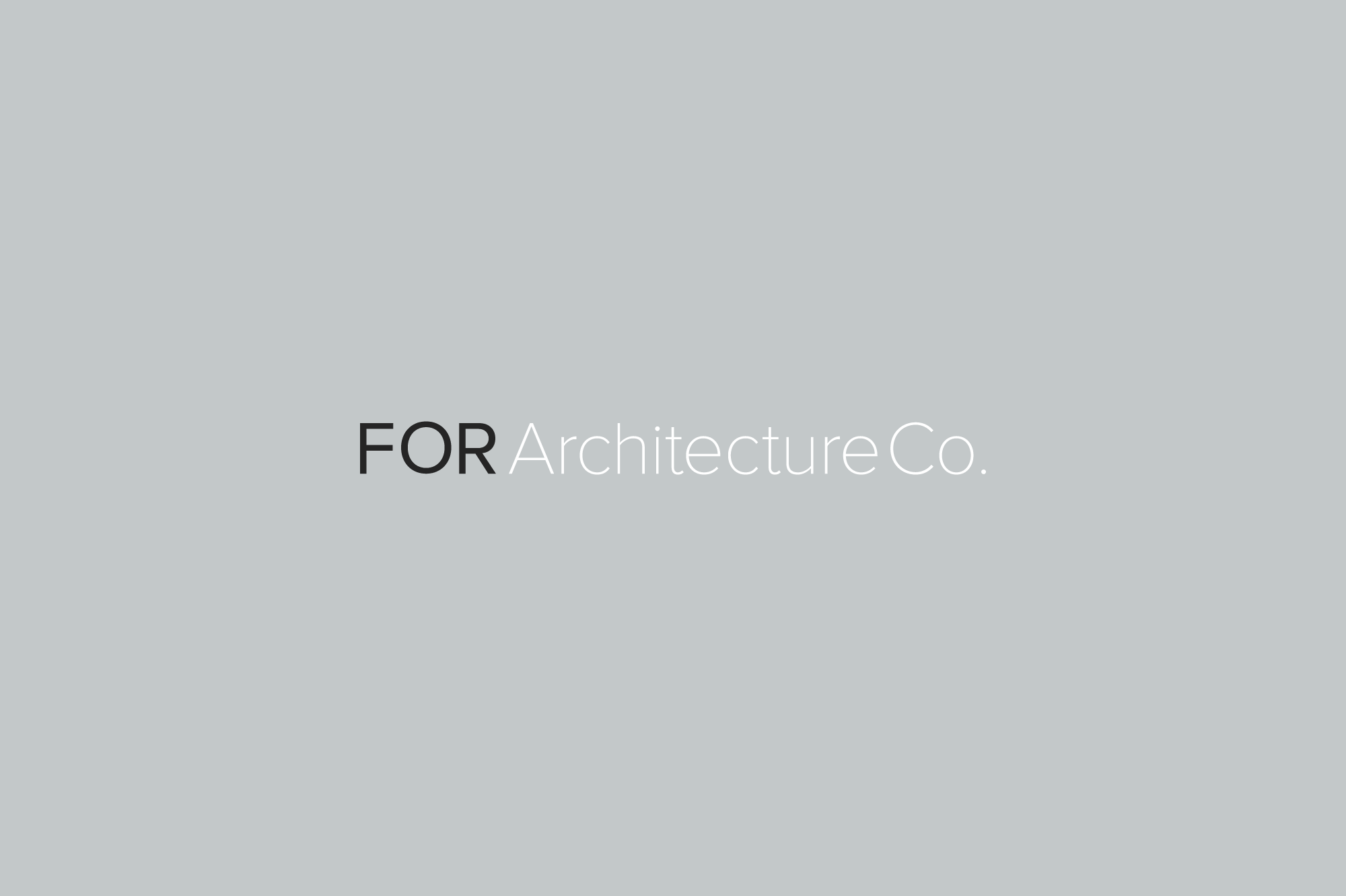
FOR Architecture Co. primary logo features a simple san serif font for that polished and modern look. While the composition is simple, the scale and weight is contrasted, yet subtle, achieving a clean balance.
The secondary logo uses the same elements as your primary logo,
but is stacked so that your brand identity is flexible. This can be used in smaller format like social media profiles or website icons.